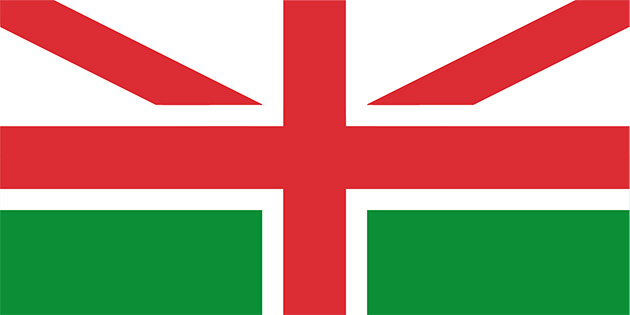
With Scotland threatening to leave the United Kingdom, We Made This mused about what the new Union Flag, sans St. Andrew’s Cross of Scotland but finally adding Wales, would look like:
They concluded with this thought:
Just spare a thought for all the flag-makers, and not just the ones for the UK, but for all the other nations and colonies that feature the Union Flag in the canton (the upper left hand quadrant) of their flags.
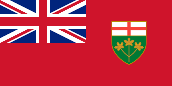
Fortunately for Canada, Pearson took us through the flag debate back in 1964. But wait, Manitoba and Ontario (loyal she remains) weren’t too happy with our modern Maple Leaf and decided to get their own red ensigns. B.C., in 1960, got its own flag based on the coat of arms which also contains a Union Flag!
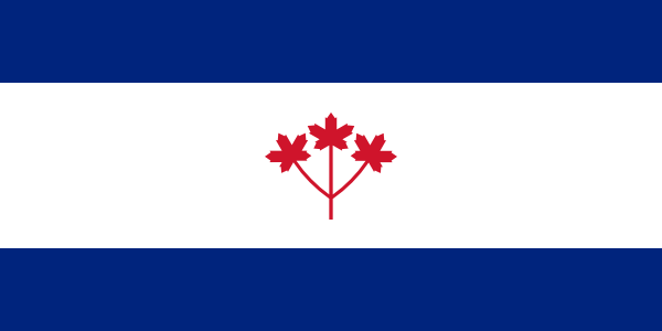
Well let’s see what we can do about that. We all like a maple leaf, right? Even Americans, supposedly, slap one on their backpacks. Well, if one maple leaf is good, how about 3?!
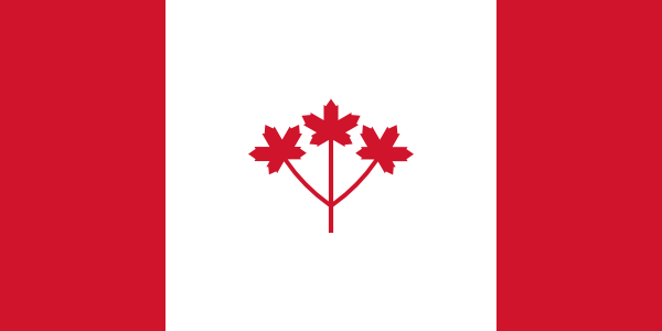
Isn’t that just the Pearson Pennant? Shut up, no. It follows the 1:2:1 Canadian triband and isn’t blue. Jerk.
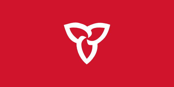
Ontario! Fuck yeah! Straight from our coat of arms! Or maybe we want to try the modern treatment? What’s more modern than Switzerland?
Sexy! But wait, we don’t want the other provinces to think that we’re getting all “Centre of Confederation” again. Don’t we have a botanical symbol of our very own, maybe one that’s ridiculously sensitive and pretty rare? Maybe it serves as our provincial symbol and went through an unnecessary and ill-advised redesign which we’ll ignore?
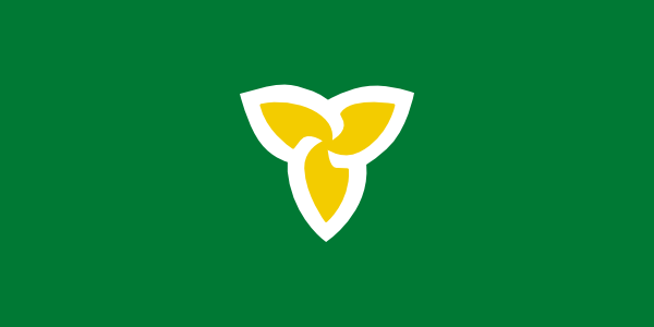
Well, that looks a bit familiar, doesn’t it? If you’ve been an Ontarian for more than a decade maybe it’s giving you a bit of warmth in your heart or head? Maybe you’re swelling a bit of pride, or is that just your sinuses?

Yes, the old OHIP card is a bit of an obsession.
Did you know that Ontario probably derives from the Wyandot Ontarí:io meaning “great lake” or Iroquoian skanadario, “beautiful water?” The lake, of course. The province takes its name from the lake. Of course. I guess we’re lucky we don’t live in Toronto, Erie. Well, how about some of that beautiful water?

Oh, what’s that British Columbia and New Brunswick? You’ve already got waves on your flags? Yeah, let’s talk about it when yours represent anything potable.
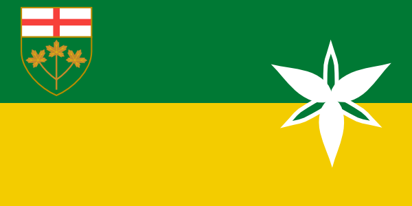
Hmm. Well, did you know that Ontario’s colours are green and gold? Apparently. Not that we’ve used it anywhere except the coat-of-arms. Well, why not the flag?
Wait, what are we, Saskatchewan?
Right.
I know what you’re saying. “Well, none of these makes me want to repel a Fenian raid or anything. But can’t you show me something that’s more… trainwreck?” Why yes, yes I can:

Vexillological joke! If that doesn’t get me laid, nothing will!

I like these, especially the green one with the yellow and white Trillium Flower in the center. How about one based on the Pearson Pennant, except with the three red maple leafs changed to gold, the white background changed to green and the blue side bands changed to white, so as to reflect the Coat of Arms? http://en.wikipedia.org/wiki/File:Canada_Pearson_Pennant_1964.svg